Cover Design Q&A: La Vita è Dolce
13 Aug 2021 |
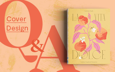
Bringing a burst of colour and warmth with this month's Cover Design Q&A, art director Susan Le from Evi-O Studio chats to us on how she created the incredible cover for La Vita è Dolce. You can follow Susan on Instagram here. Based in Sydney, the designers from Evi-O Studio have been the creative talent behind other Hardie Grant covers such as Vietnamese, Pasta Grannies and Fattily Ever After. To see more of their work, follow the studio on Instagram here.
Tell us about yourself.
Hello, I’m Susan aka Susu, art director at Evi-O.Studio. Our studio was founded by our creative director, Evi O (long-time book design wizard in the industry) and we have grown into a talented team of 8 including our studio Whippet Henri. I was very lucky to get the chance to learn the A-Z of book design from Evi as my first full-time work and have been designing and illustrating for the studio for almost four years now.
Hardie Grant UK has also been working with us since the very beginning and it’s always a joy to work with their team. The first project for Hardie Grant UK was also our first UK project. Kate Pollard got in touch with Evi in our very early days to work on a book called Lisbon. The rest is history.
What was the brief?
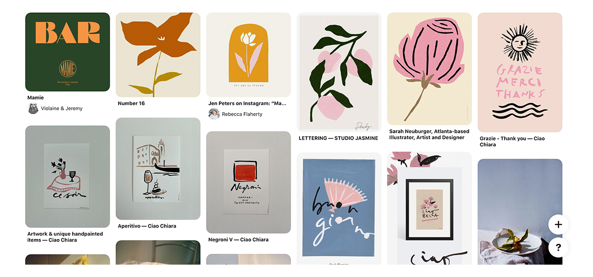
For La Vita è Dolce, I worked closely with Kajal Mistry (the publisher) and Eve Marleau (the editor). The brief was to convey a romantic and Italian inspired dessert cookbook targeted towards a feminine market. It had to be distinct from Letitia Clark’s first book Bitter Honey yet still feel like they are part of the same family without looking like a series. As with every Hardie Grant UK brief, we received a moodboard which allowed us to visualise the team’s vision.
La Vita è Dolce is the second book following Bitter Honey that you’ve designed for Letitia. How was the design process for this title different from the last one?
Being the second book from Letitia, the main difference was that there is the first book to speak to and so it becomes a brand exercise. It’s an advantage because the code is already cracked on the author’s sense of style but also a challenge in trying to keep it fresh and innovative; we try to retain the heritage while evolving the visual language.
It’s quite amazing to look back on the journey of the cover for La Vita è Dolce and how it developed. Bitter Honey’s success also set the benchmark for Dolce really high – so we went through many more rounds of design to push La Vita è Dolce as far as we could.
How did you approach the brief? Do you go through the same process with each project, or how can it vary?
There’s a metaphor we use at the Studio that defines our book design process. We see our role as designers as midwives – to deliver book babies to their authors. With that in mind, we try not to get too attached or protective of any concepts we make – it needs to grow and evolve with the author so it’s very much a collaborative process. Our most successful design work is dependent on mutual trust and an exchange of ideas with the publisher, editor and author.
Can you share with us the process of this project? What was the idea and inspiration for the cover design and layout?
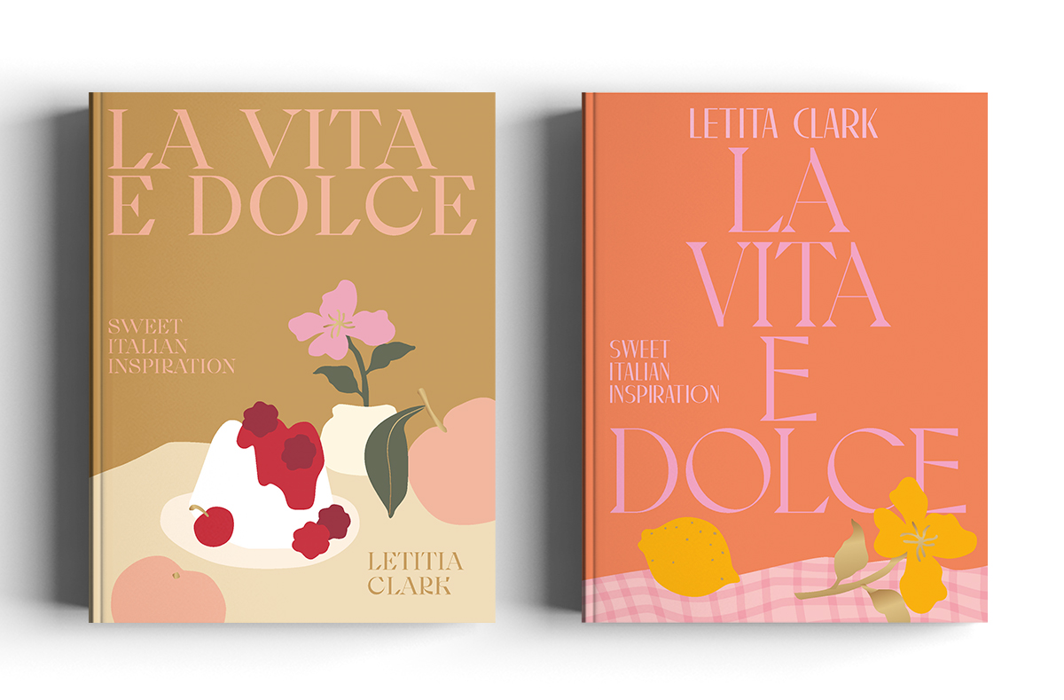
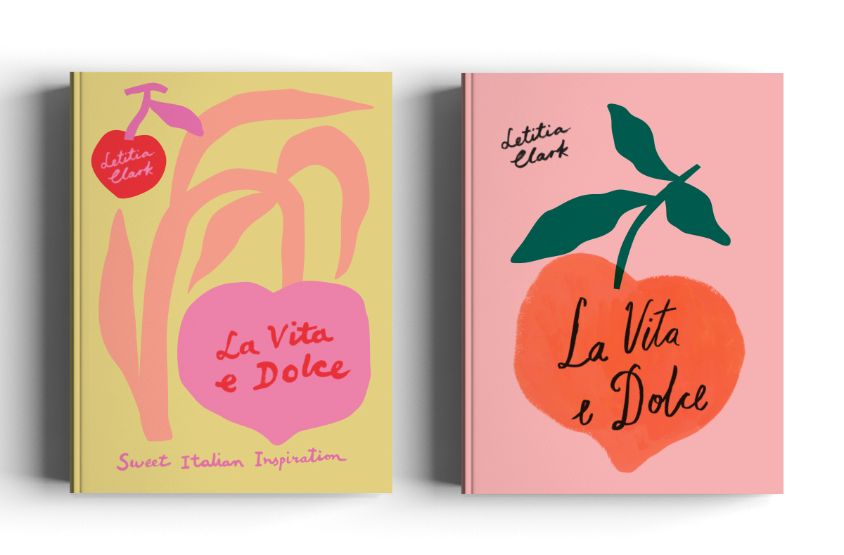
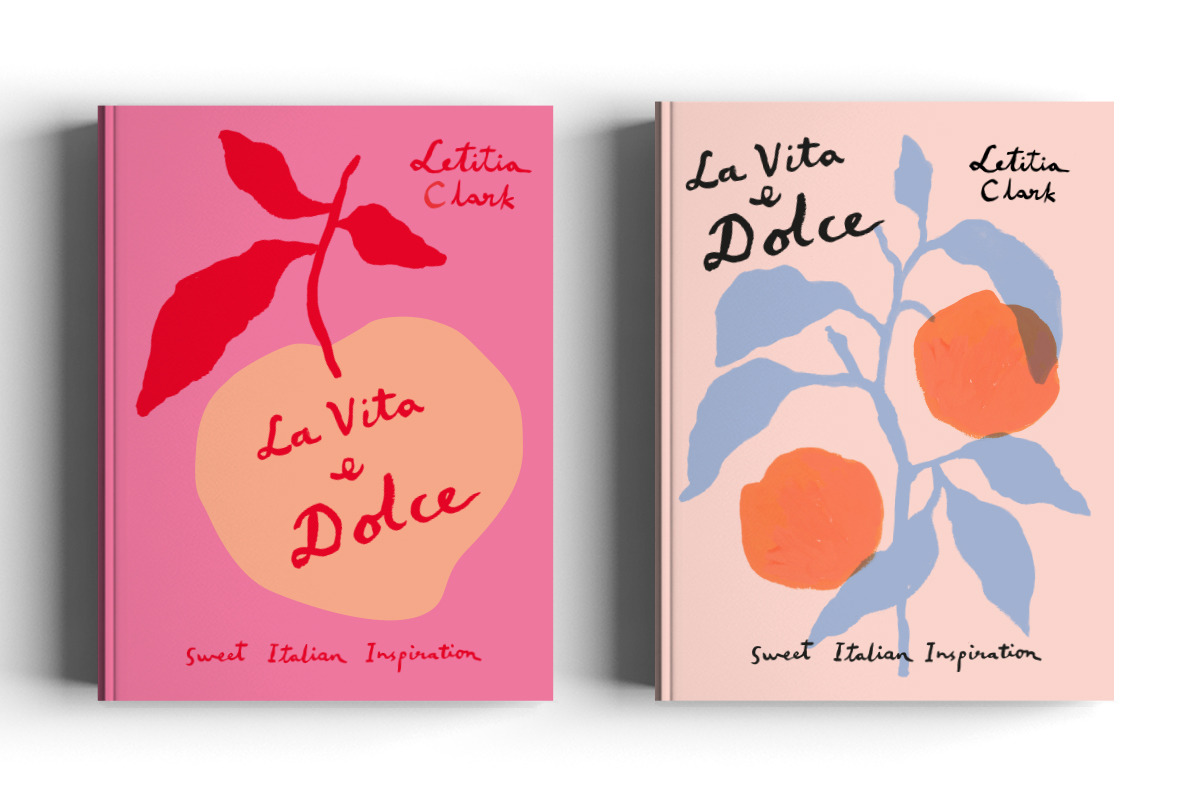
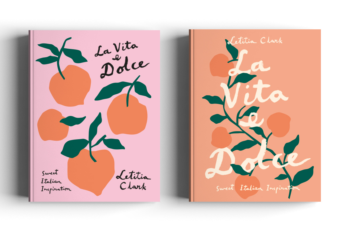
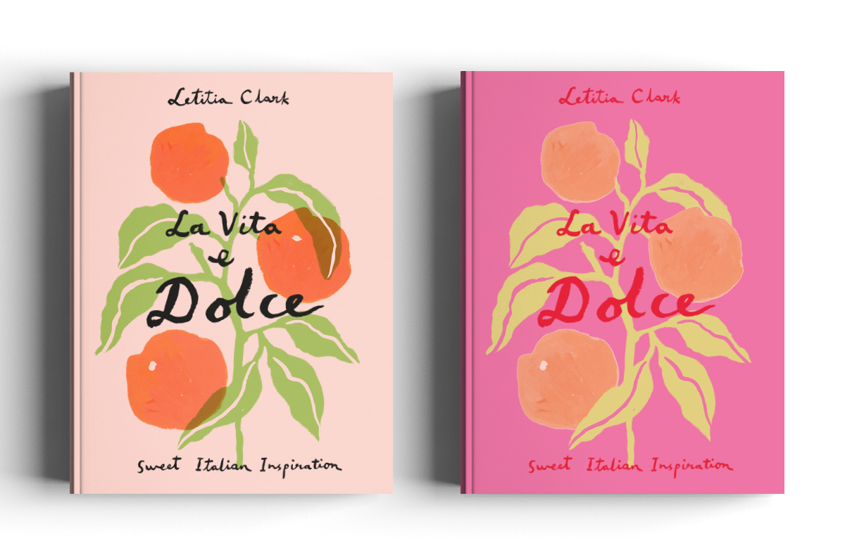
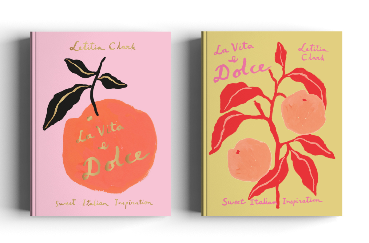
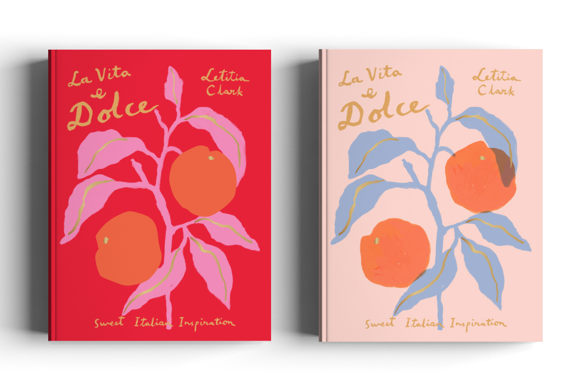
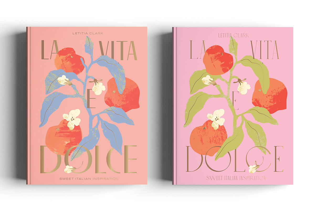
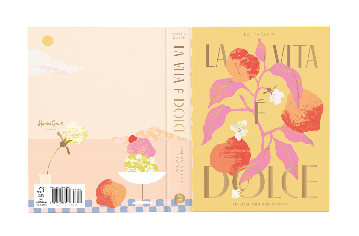
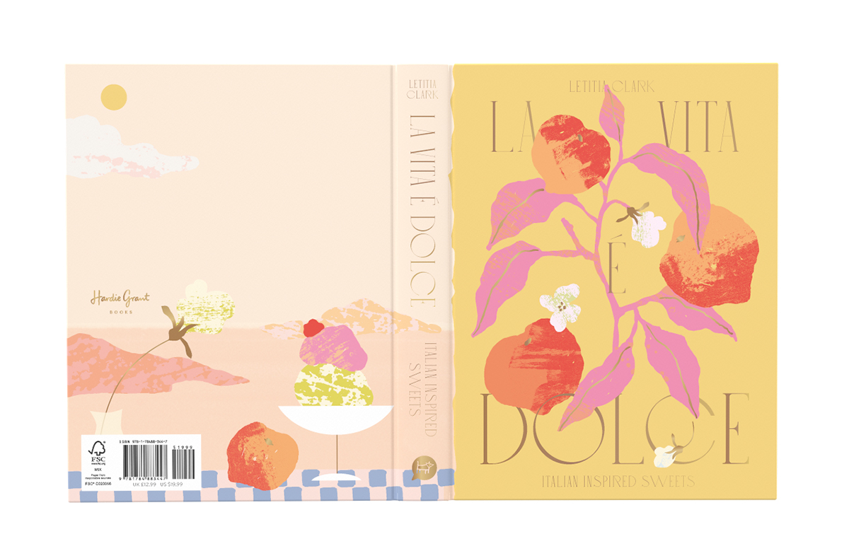
For La Vita è Dolce, initially we explored the concept of still life and decided to use a muted colour palette of coffee, cream, peaches and pinks. To tie it back to Bitter Honey, we explored romantic display fonts and suggested gold foiling.
In the next phase, Kajal was keen to expand on the peach motif and a more organic approach with handwritten text and painterly illustrations presented in the moodboard. Letitia wanted to see more vibrant colours driven by Italian desserts: cassata, cherry, peach, gelato pinks, custard, powder blue and pistachio.
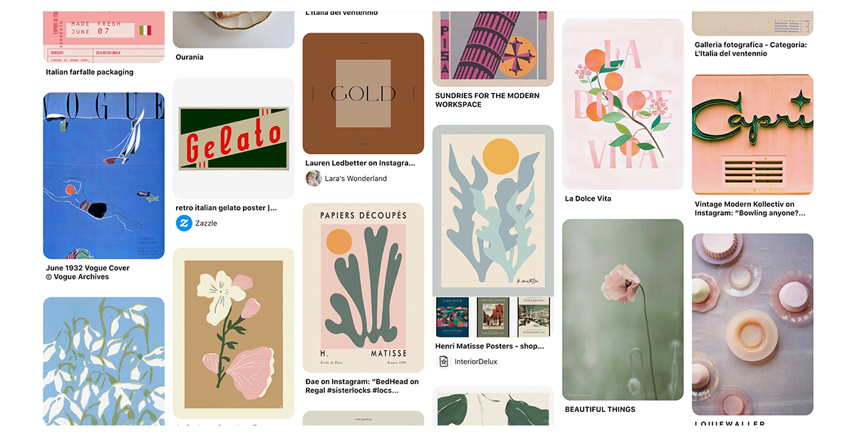
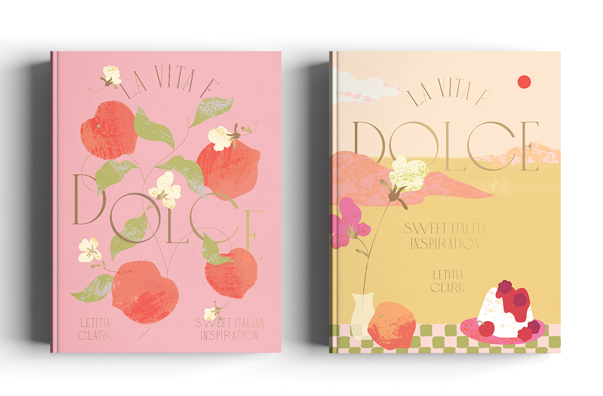
Compositions were then narrowed down with more colour explorations. But after looking at it again, we felt there was still something missing. Letitia wanted to bring back the romantic fonts we had at the beginning so that it could feel more mature and classic.
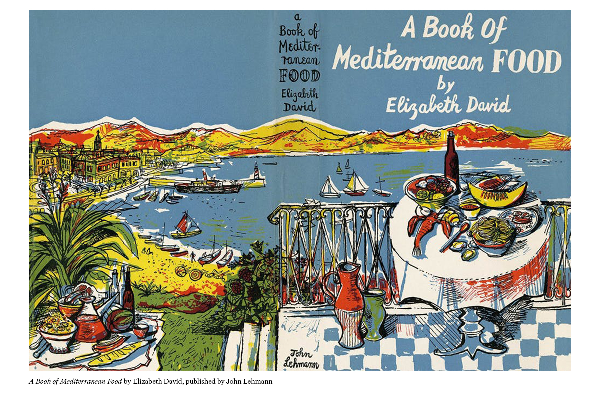
When I revisited the covers again, Sydney had our first lockdown and we all had to take our computers home. I remember having a little creative block but then Letitia shared us a visual reference A Book of Mediterranean Food by Elizabeth David which gave me that breakthrough moment to create the Mediterranean-inspired scene with the checkered table cloth. That’s when we also decided to bring back the texture from Bitter Honey.
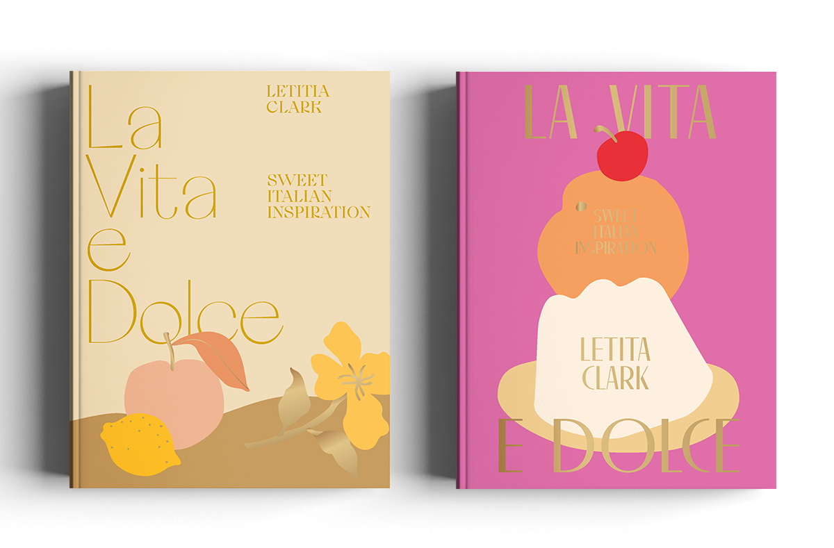
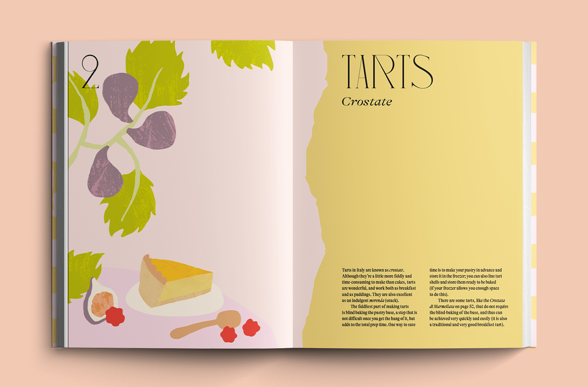
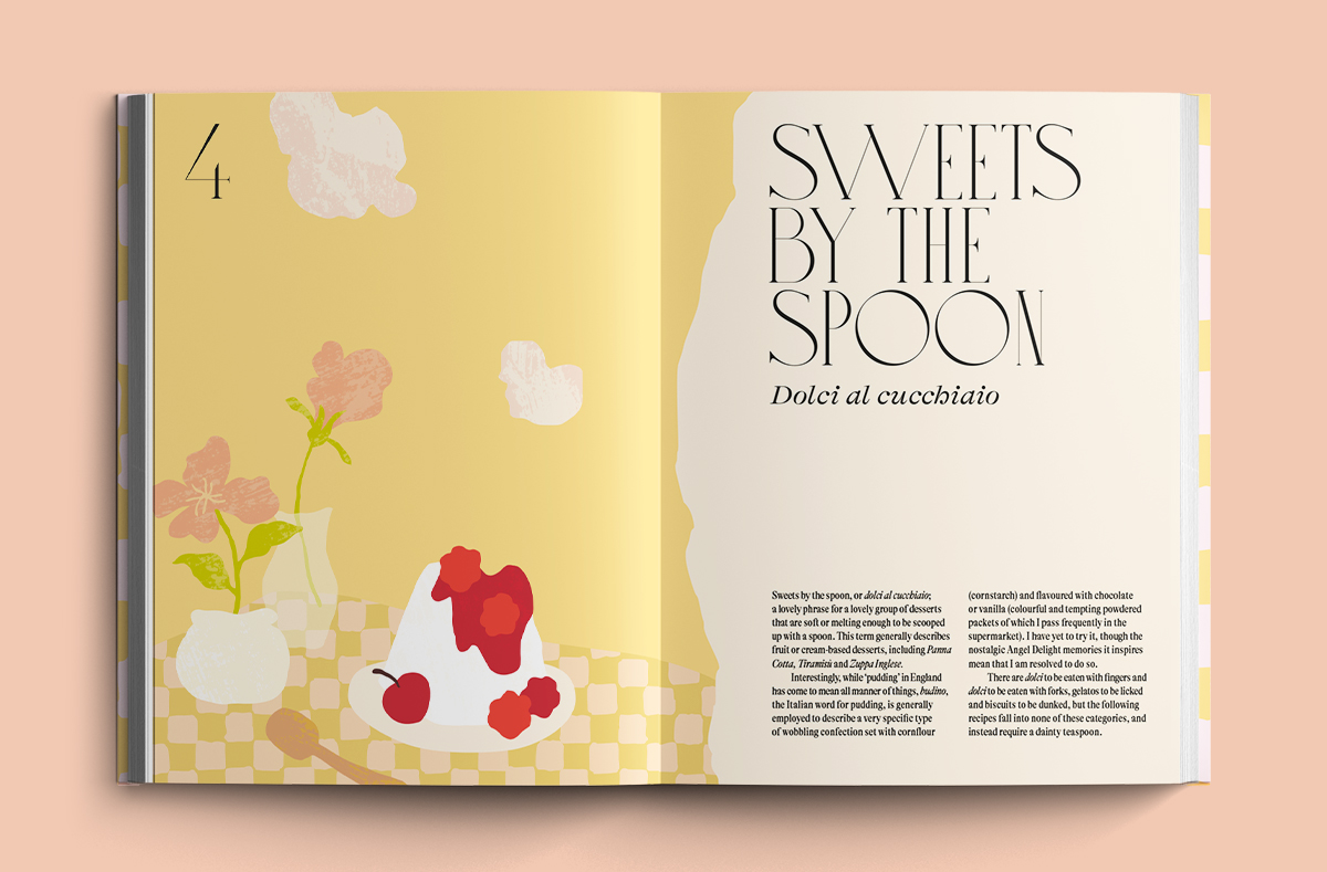
In the end, the peaches were still the favourite but because we all loved the Mediterranean scene as well, we translated this into the back cover instead, which also informed the rest of illustrations in the internals and the endpapers. (Below: Chapter openers from La Vita è Dolce)
We went for the same ragged edge along the hinge of the book that we had used in Bitter Honey. With the ragged edge spilling over onto the front cover, it hints at the back scenes and also tie the two titles Bitter Honey and La Vita è Dolce together. The only thing left to decide was which font to use.
What does a typical work day for you look like?
I love doing my 40-minute walk to work because there’s always something to discover - kids selling herbs from their local school garden; old junk and treasures that people leave on their lawn for council pickup; and peeking into the upholstery factory with their scraps of foam. When I arrive at the studio, if Henri’s in a good mood he’ll come and greet at the door. And Evi’s usually having her routine morning chat with D-Shipp (the photographer who shares our space) or Paulina (a publisher who’s also in the same building) or she’s pumping up some loud music.
Once we’re all settled in, the peckish ones (Wilson and I) will probably be nibbling at our desks and there’s the click and fizzle from Nico’s desk (her daily Minor Figures fix). If it’s a Friday or even hump day we might treat ourselves with croissants from across the road or my favourite churros donuts.
Lunch time: we either sit in the lunchroom surrounded by D-Shipp’s plants and artworks, Kait and Nico might be doing their daily crosswords, or we’ll cheer when we all have forgotten to bring lunch and will walk down the road together for our Banh Mi (Vietnamese rolls) fix. We love to belt our tunes and sing at the studio (definitely job application criteria at the studio) and if it’s Friday we’ll end with Kait’s request of ABBA hour. Of course, we do all the above while doing real work!
What are your favourite projects to work on?
Hardie Grant UK has already given us many dream briefs to work on. For me, this included a bread bible Bread Ahead and Pasta Grannies (which landed on our table literally one week after I was raving about the youtube channel to the studio). Bitter Honey was my first illustrated cookbook to design so naturally Bitter Honey and La Vita è Dolce were exciting to work on. I loved illustrating Fattily Ever After and Vietnamese and working on Hoop n Loop was fun.
Personally I have a bias towards anything involving vegetables but honestly we never get a boring brief! Overall, as a studio we love variety and can’t wait to sink our teeth into the next new idea and flex our creative muscles. As the saying goes, never say never.
Have you cooked anything from La Vita è Dolce or Bitter Honey? Which is your favourite recipe?
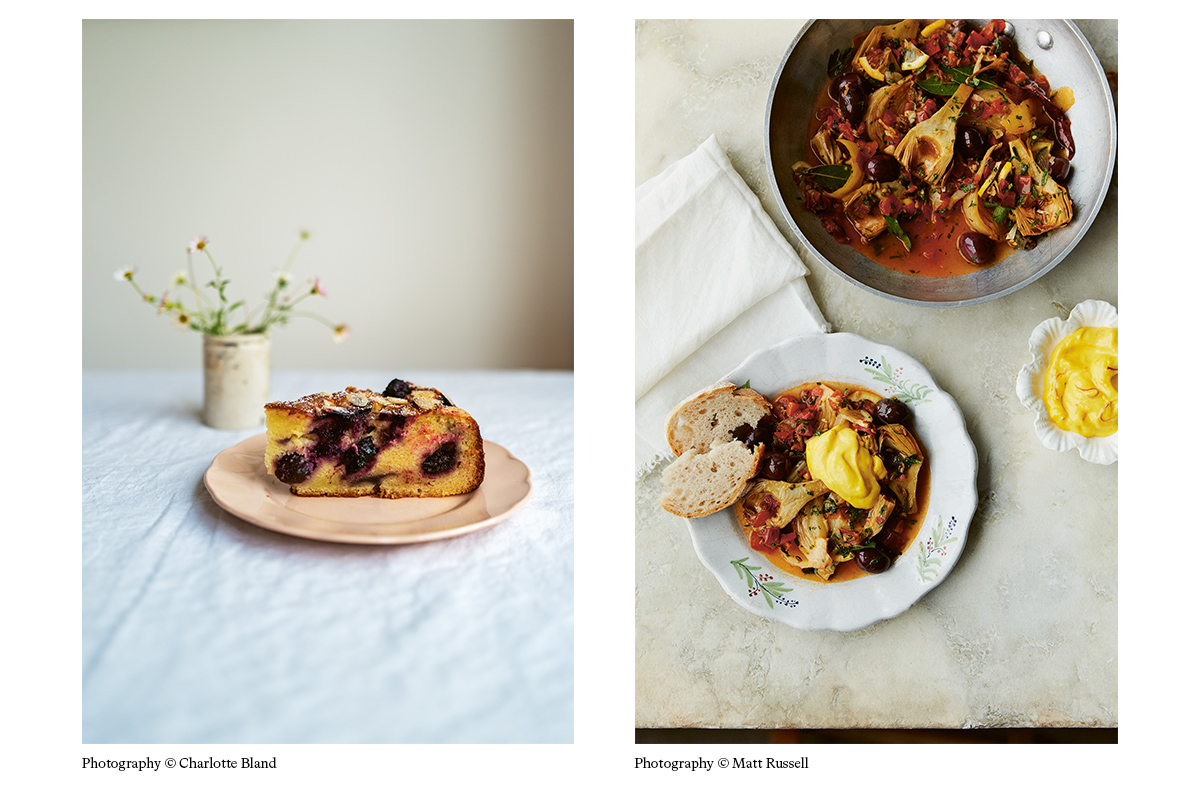
The Almond, Ricotta, Olive Oil & Cherry Cake (below, left) from Dolce is amazing. I never knew making cake with olive oil was a thing until I worked on Dolce. It’s such a simple cake but has two of my favourite things: cherries and olive oil. Sounds like a strange combo but it’s so beautiful. I also learnt how to prepare artichokes for the first time after working on Bitter Honey and cooked the Artichokes braised with Sage, Lemon, Fennel and Olives (below, right). Yum!
What is your workspace set up like?
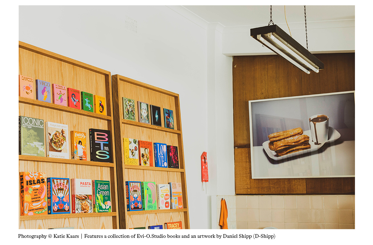
Our studio has been getting some fresh renovations lately so here’s a little sneak peak into our upgraded space. We’ve been dreaming up a display bookshelf since forever and it’s finally here!
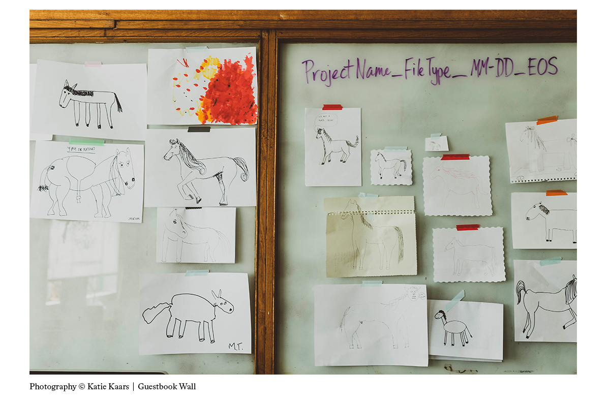
We also started a little guestbook wall, so anyone who visits us has to draw a horse from memory and stick it up on the wall. (The backstory: One day we were talking about how hard it is to draw horses from memory so we took the challenge to draw them ourselves and ever since we kept growing the collection asking guests to contribute to the wall.)
Read our previous Cover Design Q&As!
- The Italian Deli with Katherine Keeble
- Crave with Claire Rochford
- Sea and Shore with Nikki Ellis