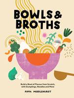
Cover Design Q&A: Bowls & Broths
17 Sep 2021 |
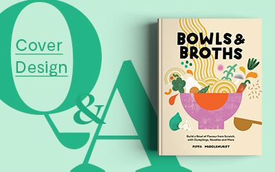
Welcome back to our blog series Cover Design Q&A, where designers and illustrators take us behind-the-scenes on their process of designing covers for our titles. This month’s cover in focus is Bowls & Broths, created by graphic designer and illustrator Han Valentine. Han's bright, bold design earned Bowls & Broths a spot on The Bookseller's round-up of the best UK book covers released in August.
Based in Manchester, Han’s fun and colourful illustrations have appeared across posters, packaging, books and now ramen bowls! Han also designed the cover for Pippa’s first book, Dumplings and Noodles. We spoke to her about the inspiration behind the Bowls & Broths artwork, networking as a freelancer and her favourite projects. You can find Han’s work on her Instagram or on her website. She’s hoping to set up her own shop in the future, so keep an eye out for exciting plans!
Tell us about yourself.
My name is Hannah and I’m a Graphic Designer and Illustrator based in Manchester. I graduated with a degree in Graphic Design from Manchester School of Art in 2017 but have been making and creating in one way or another for as long as I can remember. After university, I started to explore more of an illustrative approach to my creative work and found a happy place between the two mediums. I’ve been self-employed for almost four years now and took the leap this time last year to doing freelance design and illustration full time!
How did the opportunity to design Pippa’s books come about?
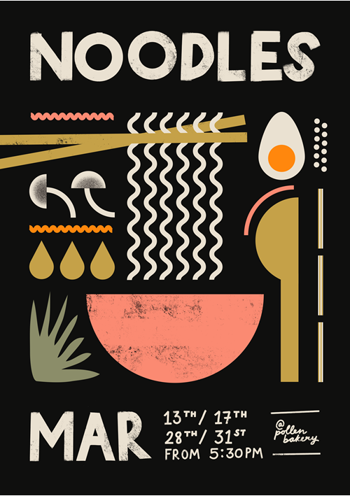
I’ve known Pippa for a few years now. She used to come to the pub I worked in here in Manchester and had seen the posters I’d designed for events and DJ slots. She got in touch about some poster work for her workshops and supper clubs. She was actually the first client I used my iPad, Apple pencil and Procreate with after investing in them! It kind of snowballed from there and we’ve worked together loads since, from the posters to product labels, to designing a pair of Polka Pants. We’ve really honed in on the Pippy Eats brand visuals over the years, with the help of Intercity Studio along the way. So I guess naturally, the next step was to illustrate and supply custom type for her published work to keep things consistent and familiar.
What was the brief?
The focus of this book is layering and building a good bowl of food, so Emily Lapworth (Senior Designer from Quadrille and my main point of contact throughout) wanted the cover design to reflect that. We needed it to be visually similar to Pippa's last book Dumplings and Noodles. However as they’re not strictly part of the same series, I had the freedom to explore some different layouts and design styles.
Emily picked out a formulaic design concept, similar in style to a poster I’d previously done for Pippa and we also discussed the idea of ingredients being chucked into a bowl. Lots to play with!
Whom did you have in mind as the consumer/audience?
Pippa’s already got a pretty solid audience who have become familiar with her work and brand (both in person and through Instagram), which is great as they instantly recognise the illustrative style we’ve developed. The cover obviously also needed to be eye catching for new readers too, so something accessible, welcoming and playful was a must.
Bowls & Broths is the 2nd book that you’ve designed for Pippa. How was the design process for this title different from the last one?
I think this cover definitely came more naturally than the first, but that might just be me feeling more confident and not having the anxiety and self-doubt that I tend to get when first working with a new client. We had the Dumplings and Noodles cover as a starting point this time, which has a band around the middle to house the illustrative elements. I liked knowing I could explore something in line with that, but that it didn’t have to be like-for-like with the new title. Once I’d gotten that initial ‘follow on’ route out of the way and drawn out some of the ingredients, everything just began to flow into the many different concepts.
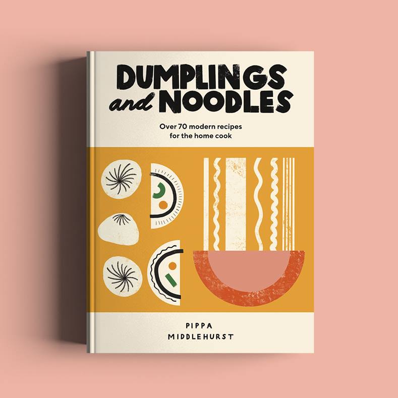
Emily had mentioned that we could explore a more type-heavy design too, which really stopped me falling into a trap of developing a lot of illustration-heavy concepts purely out of comfort. In the end, we kept the cover type quite similar to Dumplings and Noodles and added in a hint of the band element to the spine so that there are some subtle links between the two books.
Designing with Pippa as an author is quite stress-free as I have the benefit of having already worked with her for so long, I like to think I have a good idea of what she does and doesn’t like in terms of her brand design and illustrations. Having a sales team to add valuable marketing input can shake things up sometimes but it’s not a bad thing at all – it definitely helps me think about things from a different perspective and really consider factors I might not necessarily need to have in mind for a lot of the other work I do.
Can you share with us the process of this project? What was the idea and inspiration for the cover design and layout?
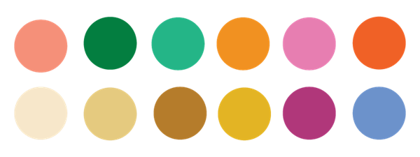
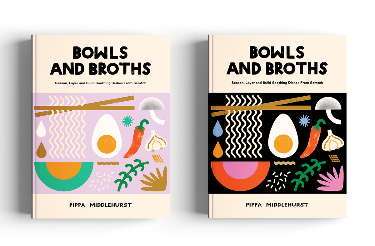
I tend to start most of my work by playing around with colour palettes. Emily had sent over a swatch for a vibrant jade green that Pippa had said she liked, so that was secured as one of the greens in the palette. Pippa and I are big fans of pinks, so I threw some of those into the mix alongside some neutrals for things like broths, noodles and dumplings and a fun yellow-orange not too dissimilar to the Dumplings and Noodles main cover colour.
The palette ended up being quite the rainbow and I really love the contrast of the pinks and greens throughout. Once I had a bit of a base palette going, I swapped other colours in and out throughout the development of the cover – things like lilacs, different shades of reds and dark greens etc.
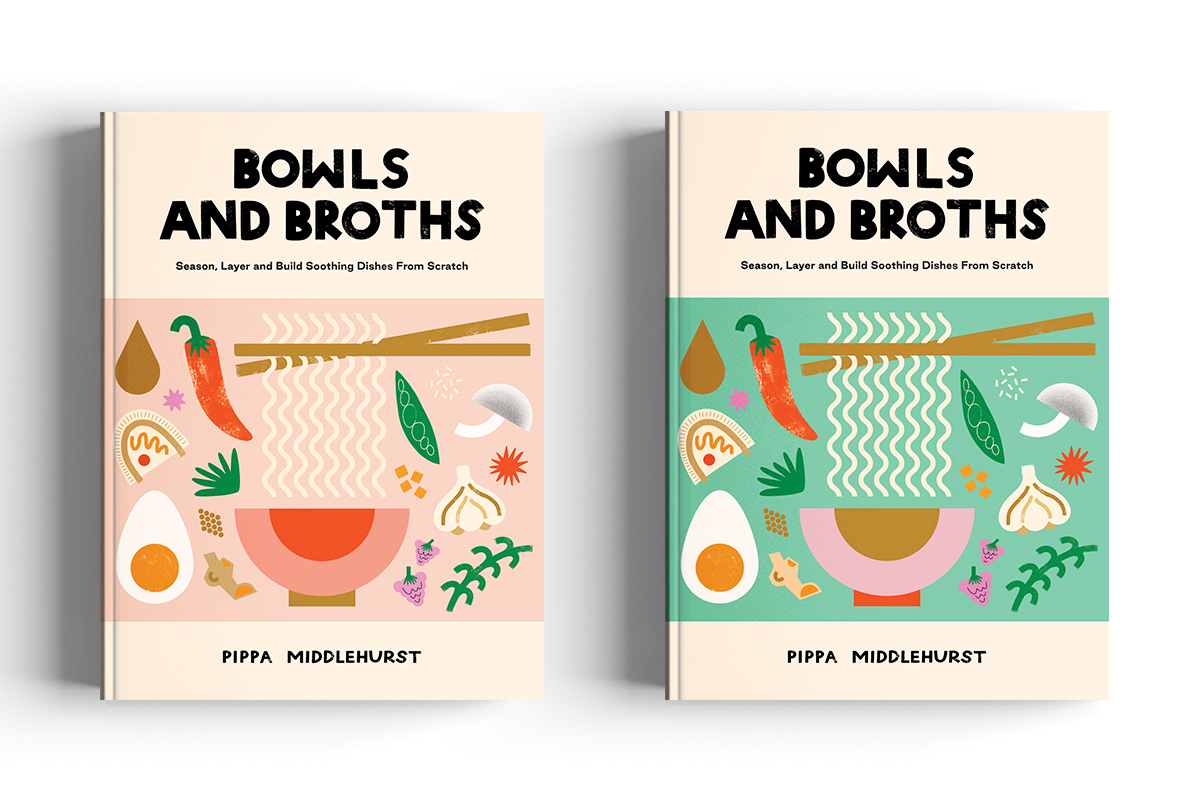
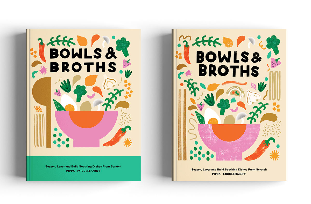
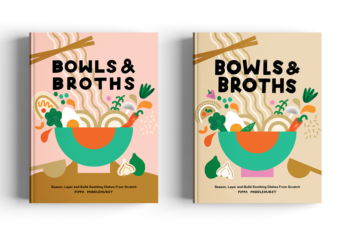
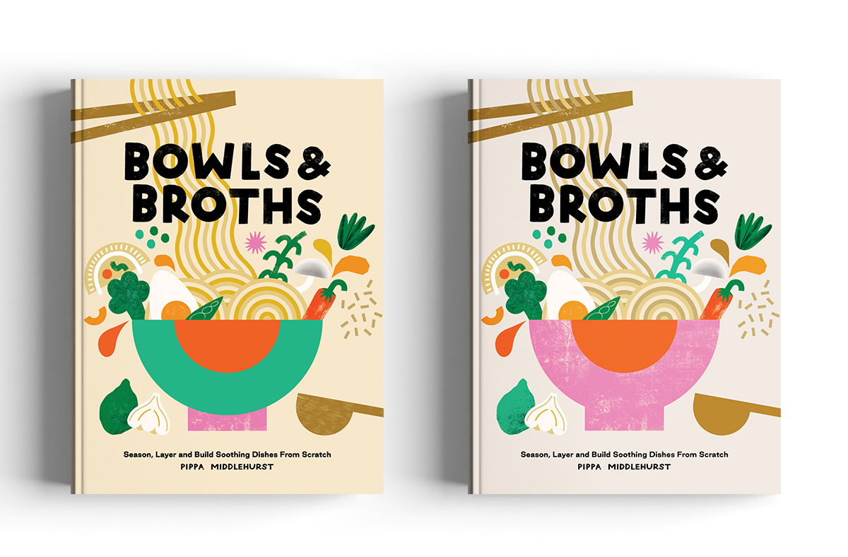
As aforementioned, the most logical place to start for the actual concepts was with a banded design to match Dumplings and Noodles. With this second book being more about layering and combining flavours, it made sense to go for a busier illustrative section. I took Emily’s direction with the ‘building a bowl’ idea and the formulaic feel and created two different outcomes, which were nice and consistent with the previous book but didn’t really stand out as their own thing.
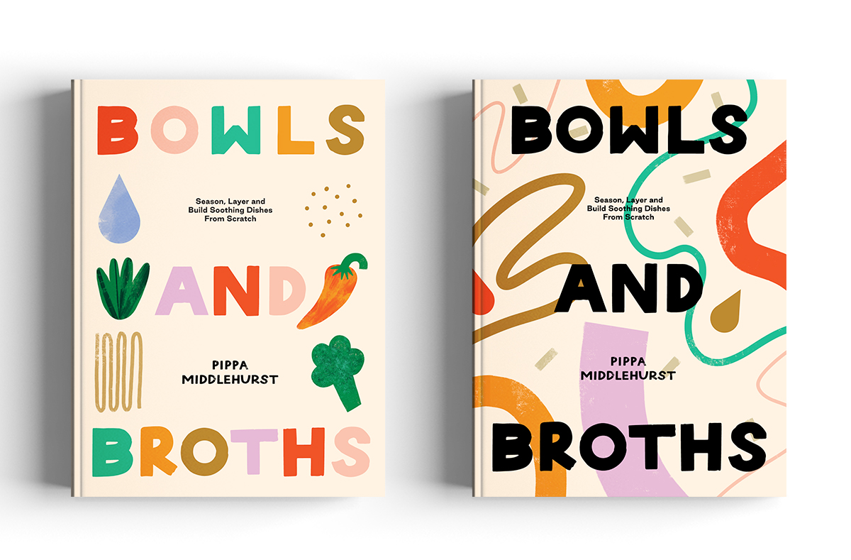
Then I went back to what was mentioned in the brief about exploring a more type-heavy direction. The title Bowls and Broths sits nicely at a higher point size on the page, and this gave me a basis for a bunch of different concepts that displayed the illustrations in and around the type in various ways. I went from icons to patterns, to really simple stacked shapes to represent this notion of ‘building a bowl’. I really like the more abstract developments that came from this route, but I knew deep down they weren’t quite so on brand and not massively cohesive with the previous book.
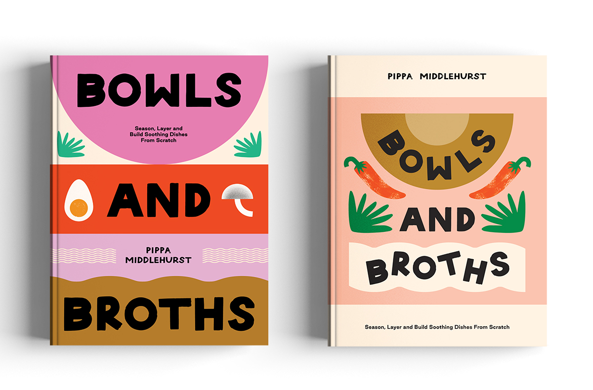
The last cover designs I did in the initial batch of ideas were a little off-piste and far more illustrative than anything I’d previously put forward for either of the books. And I think I knew from the second I’d worked them up that they were my two favourites. Back to referencing the ‘build a bowl’ idea, I reduced the colour palette a little bit and went full whack illustrating a bowl being filled with different ingredients. I thought this could have plenty of room for development with different colourways, foods, compositions and cutlery. And then I deconstructed this design into a more formulaic cover which laid everything out flat, piece by piece.
Luckily the Quadrille team and Pippa picked those two out as their favourites to pursue too – happy days all round! I worked through a round of feedback on both of those routes: simple bits like getting rid of the block background elements and moving elements around slightly, before the winning route was chosen.
We agreed to try and make things look a bit lighter and punchier, so I set off picking out the perfect background and noodle colour combos and had a tweak of the bowl colour to help up the overall vibrancy of the final cover.
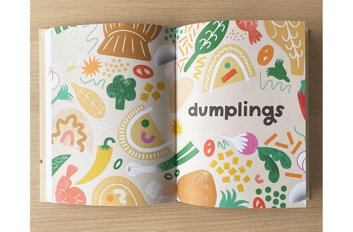
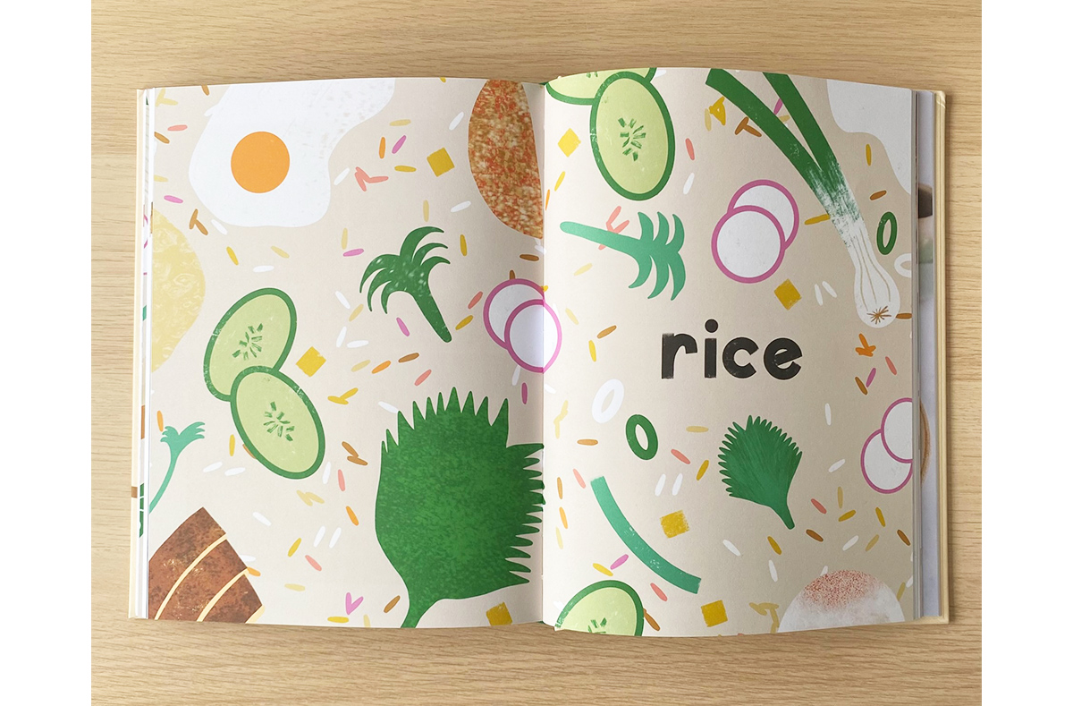
It was such a fun, smooth process and definitely a piece of work I felt really confident in right from the initial designs PDF, which can sometimes be a rarity but a welcome feeling nonetheless! Once the front cover was signed off, Emily worked up the back cover using some of the individual illustrative elements and I set about illustrating the chapter openers (Photo courtesy of Emily Lapworth) using an extended colour palette based on the cover. Such a joy to work on from start to finish!
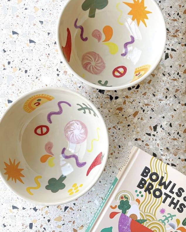
Your illustrations were used to create ceramic ramen bowls for Pippa that were part of the Bowls & Broths pre-order giveaway. (Below, photo credit: @pippyeats) Can you tell us more about this collaboration and how you felt when you saw the final product?
This was so different for me! Rebecca Morris, a ceramicist based in Manchester, had a handful of bowls that I was able to go wild on. It was a challenge as 90% of my work is entirely digital so I’m like a fish out of water with a paintbrush in my hand, especially so with a new process like this that I’d never done before. It was really enjoyable to sit and paint for a day though, away from a computer screen for once! Becky fired those versions, and then we brought in Suzie McDaniel (another ceramicist who is part of the same collective as Becky) to hand paint a second batch based on my original designs. Suzie’s painting made for a really neat set of final bowls, ready for a lucky winner! It was lovely to see something so fancy and limited edition with my designs on – so excited for whoever gets their mitts on them!
Looking through your Instagram, you’ve collaborated with different brands and worked on a wide range of projects – from event posters to shop windows to books. What is your favourite kind of project to work on and why? Is there anything you would love to try/experiment but haven’t had a chance to?
I really do love working on full books with the Hardie Grant team, as I particularly enjoy working up type-based layouts and making things all fit in place like a jigsaw. It’s super exciting to see books I’ve designed in shops too. I don’t think that feeling of disbelief that it’s something I’ve created will ever go away!
I do have a soft spot for posters, as they’re what I began churning out right after I graduated and are, in a way, where my career began. I spent a couple of years working as an in-house designer of sorts in a local hospitality company where I had free reign on things like event posters, promo posters and fun print deliverables, which I really enjoyed. I don’t get so much of that kind of work in my inbox nowadays, but I think it’s definitely the sort of work that comes naturally to me and I love it when I can mix illustration with design so heavily. It feels very ‘me’!
I would love to design and illustrate a full cookbook as they’re always the kind of thing I see and think ‘I wish I’d done that!’. I’ve been really proud of the two I’ve already played a part in, and food is my go-to thing to illustrate so it’d be ace to combine the two more.
I always feel like I’ve got a longing to slow down my client work and develop the illustration side of my practice more nowadays as I don’t get much chance to just sit and create for fun and refine my personal style. I’d love to have a little online shop selling illustrative prints and conscious wares one day – manifesting it here so I finally get round to doing it!
How do you network as a freelance illustrator/designer and do you have any advice or tips on this for fresh graduates just starting their career?
I was quite lucky when I graduated as I landed a lot of opportunities off the back of the hospitality job I worked at, and things really grew quite quickly in the first two years. It was a godsend that I worked in a pub that had such creative links (The Pilcrow Pub, now known as Sadler’s Cat) and so was able to network a bit there. I think things like portfolio reviews are really valuable post-uni and I love hearing other designers and illustrators talk about their practice in seminars and panels - whether that be IRL or online. They’re a nice way to be around and meet people in similar career circles without being too overwhelming and networky, I find!
I think social media is such a useful tool too; make yourself a Pinterest business account, upload your work and link it back to your website or social media accounts, use hashtags to your best advantage on Instagram and seek out accounts that reshare work. Support other people whose work you love because what’s nicer than someone championing you and your creativity!? I think just generally being a kind and helpful person goes a long way in the creative industries!
If you were a typeface, what would it be?
I’m always mostly drawn in by retro, high contrast, somewhat irregular typefaces. Basically, anything that looks like it’s come off the cover of an old book or record, or directly from The Peculiar Manicule. I think Jeanette & Brandywine is one of my favourites ever so maybe I’ll go with that. I have such a love for hand-drawn type too though, so perhaps it’d be a traced or hand-drawn version of it to really make it ‘me’?
If you were to host a dinner party, which dish(es)/recipe(s) from Dumplings and Noodles or Bowls & Broths would you make for your guests?
Ooooh I would 100% go for something veggie that caters to everyone, like Hot Oil Biang Biang Noodles from Dumplings and Noodles, and then do a bunch of different sides. Crispy Spicy Potatoes (because as Dolly Parton says, I’ve never met a spud I didn’t like!), prawn toast, wok fried greens. The whole shebang. I might even try my hand at making dumplings again for the occasion. Hopefully they’d look a bit more presentable than my first attempt from when I went to one of Pippa’s workshops. I need lots of practice!

 Bowls & Broths by Pippa Middlehurst is out now, available from local bookshops, Waterstones and Amazon.
Read our previous Cover Design Q&As!
- The Italian Deli with Katherine Keeble
- Crave with Claire Rochford
- Sea and Shore with Nikki Ellis
- La Vita è Dolce with Susan Le