Cover Design Q&A: The Nordic Baker
29 Nov 2021 |
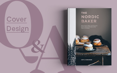
Welcome back to our Cover Design Q&A blog series, where designers and illustrators take us behind-the-scenes on their process of designing covers for our titles. Leading us into winter this month is Gemma Hayden, as she talks us through creating the beautiful cover for The Nordic Baker. Gemma is a senior designer at Quadrille and has previously worked on titles such as Quilting by Hand and Little Stories of Your Life. You can find her on Instagram here.
Tell us about yourself.
Hi I'm Gemma and I've been at Quadrille for 9 years now. I studied Graphic Design at Middlesex University and have always been creative from a very young age. I love the variety that working in book design brings, and especially love working on gift and lifestyle books. I am also a mum to a two-year-old toddler who keeps me on my toes when I'm not busy designing books!
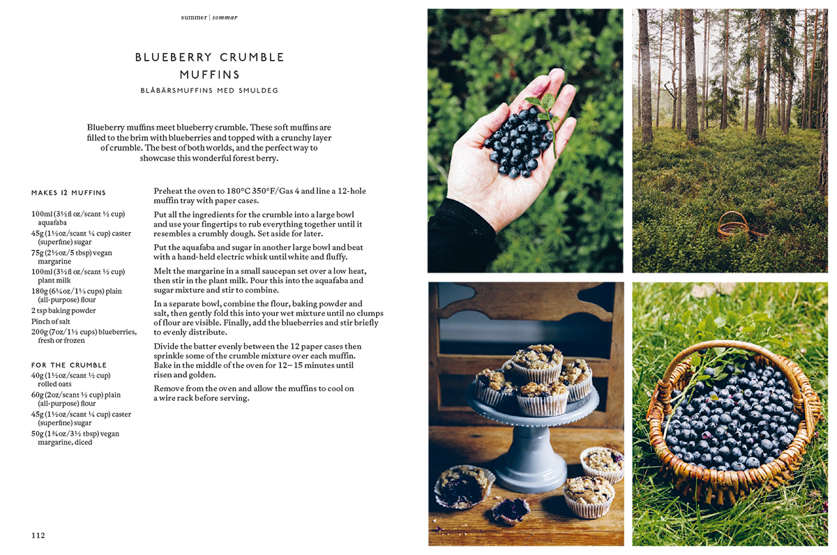
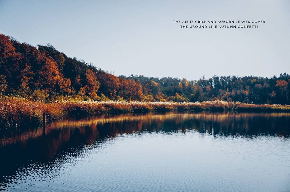
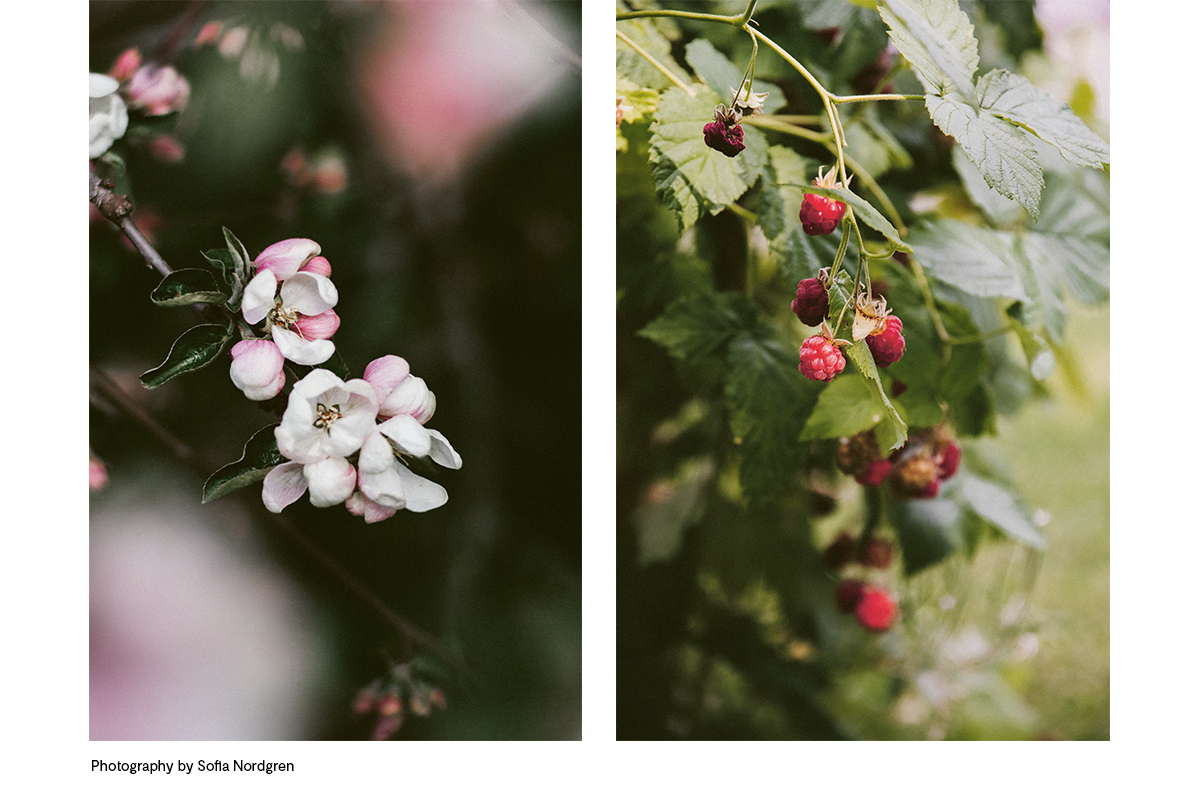
What was the brief?As The Nordic Baker is a seasonal cookbook, each chapter is closely linked to nature and the changes each season brings in terms of ingredients and things we eat at different times of the year. It was important to bring a strong sense of nature to the internal pages as well as to the cover. The author Sofia had taken some beautiful images of the Swedish landscape and seasonal highlights, such as berry picking in the forest, which I was able to use throughout the internal page design and as quote pages.
Whom did you have in mind as the consumer/audience?
I think I realised from the start that I was a good example of the audience of this book - as a lover of all things Scandinavian, slow and seasonal living, and cinnamon buns! It was also important to make sure the book would work for existing followers of Sofia’s blog and Instagram, who enjoy the gentle mix of plant-based recipes and Scandi lifestyle.
Can you share with us the process of this project? What was the idea and inspiration for the cover design and layout?
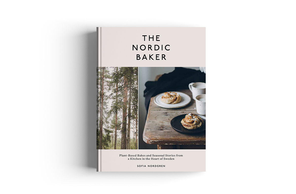
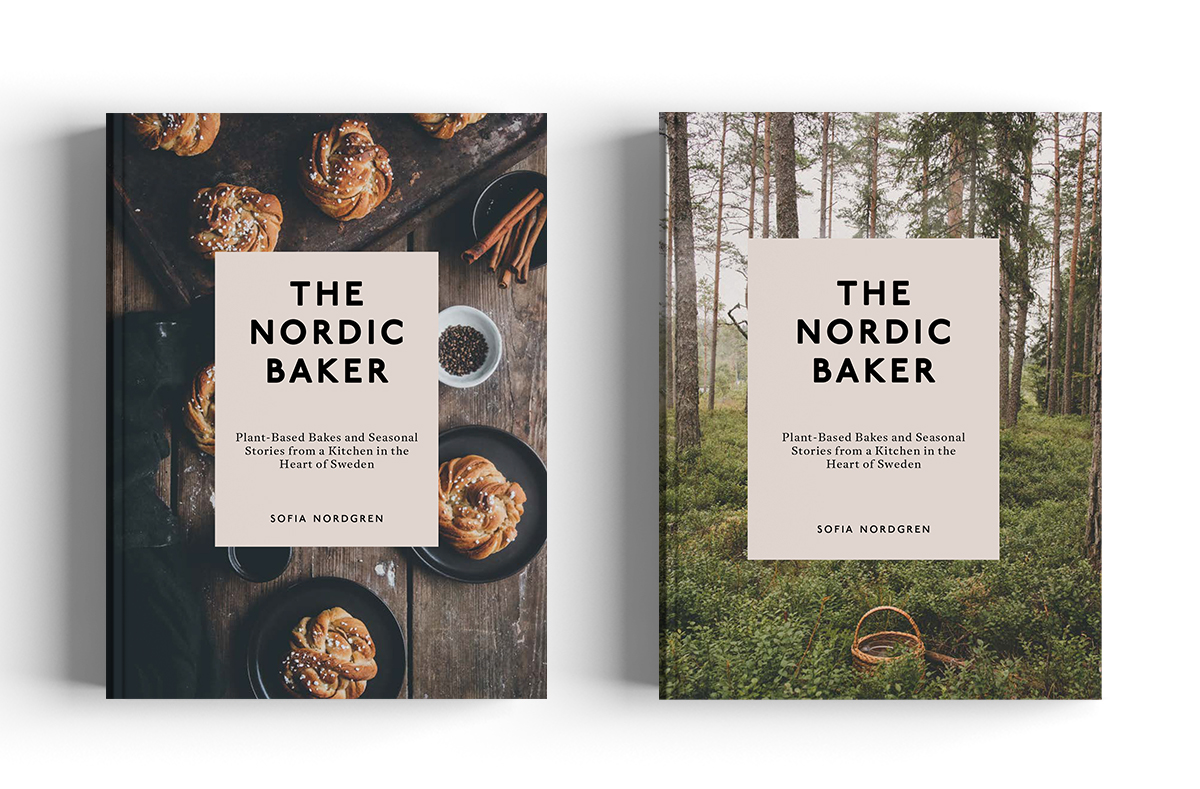
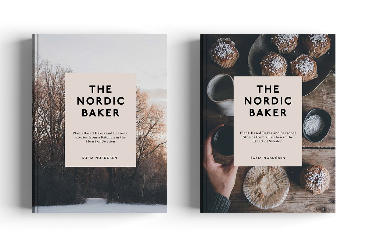
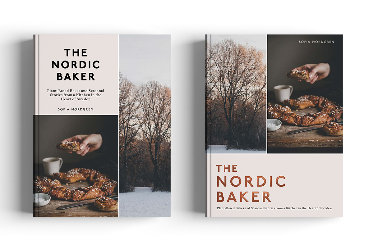
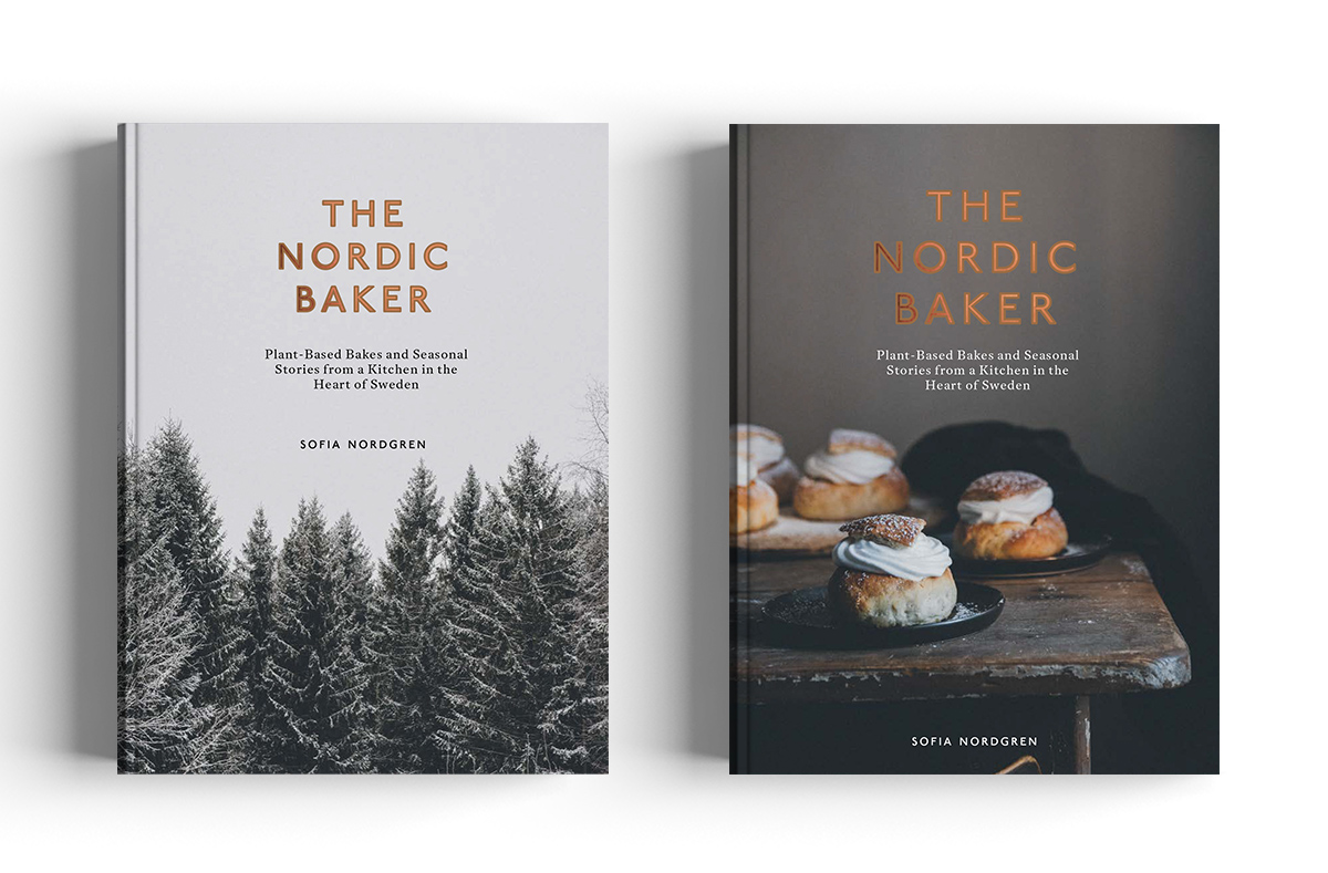
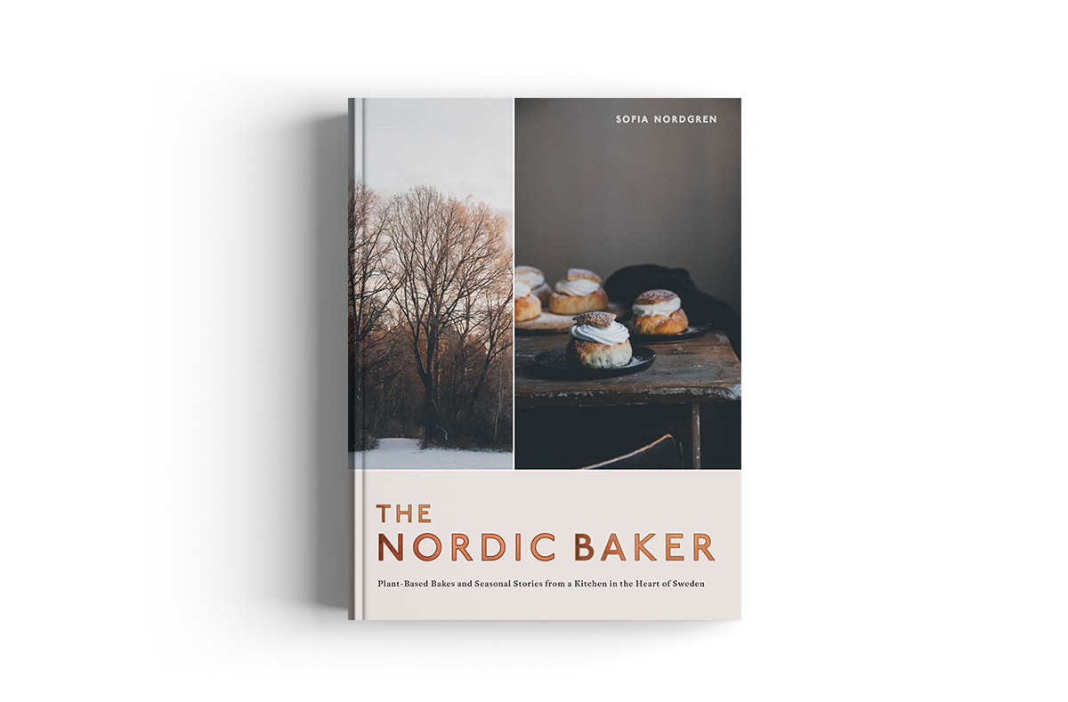
Early on in the project we needed to create a holding cover for our catalogue. As I wanted to combine nature and food, I used two images side by side and a clean, modern font as our starting point and I think it set the tone for the direction we were headed.
I tried a few options of just food, and just nature but as the project went on, Harry the editor and I kept coming back to the combination of nature and food side by side… they felt like they really fitted the brief. I introduced some foil to the title typography too at this stage as we knew we wanted to make this book feel like a really special package.
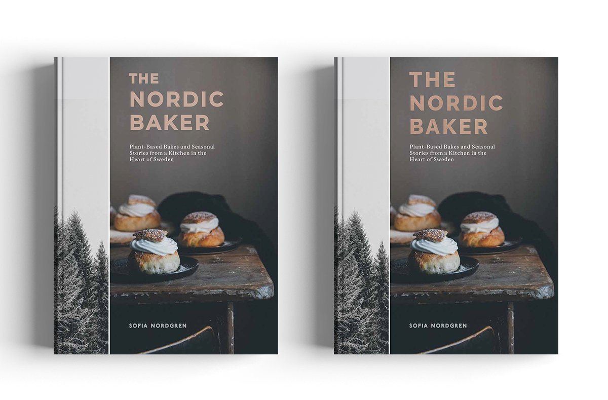
As we progressed our image selection became narrower and narrower and we realised we were most drawn to the warmer, moodier selection of Autumn and Winter images - golden buns along with the forest and the trees. This would also be a perfect fit for our November publishing date.
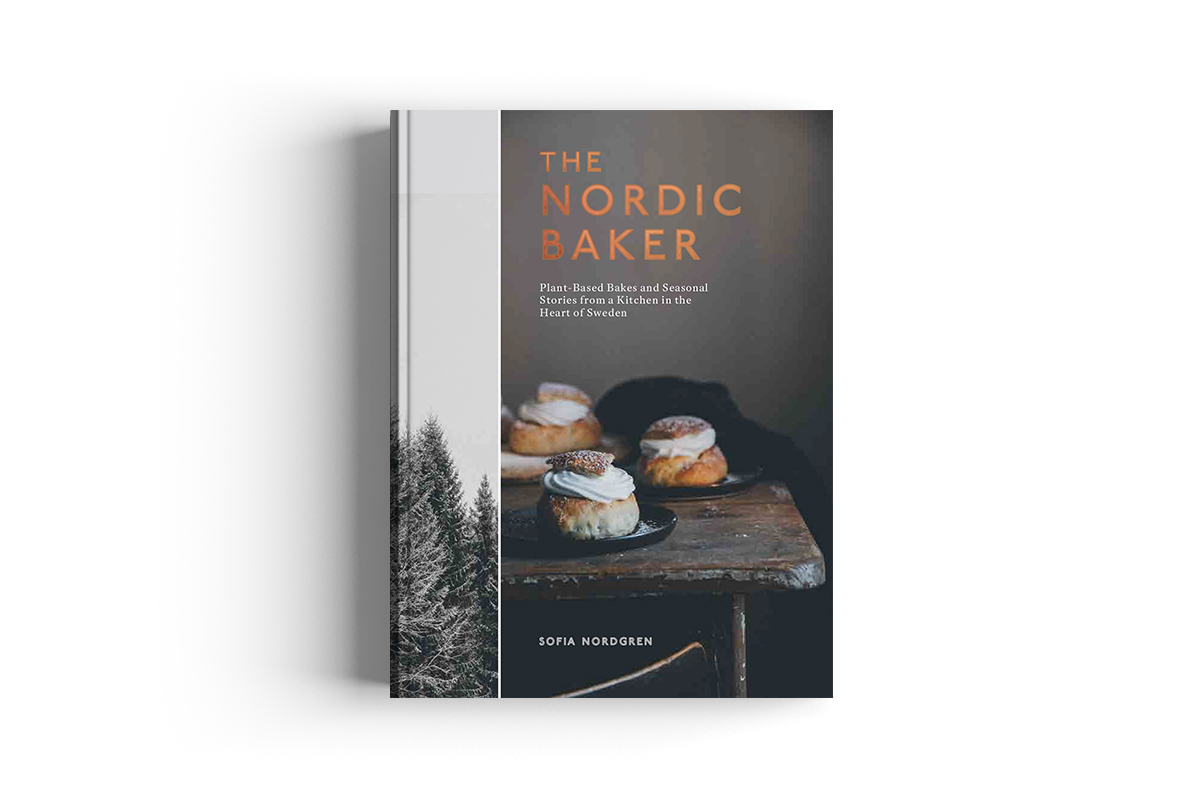
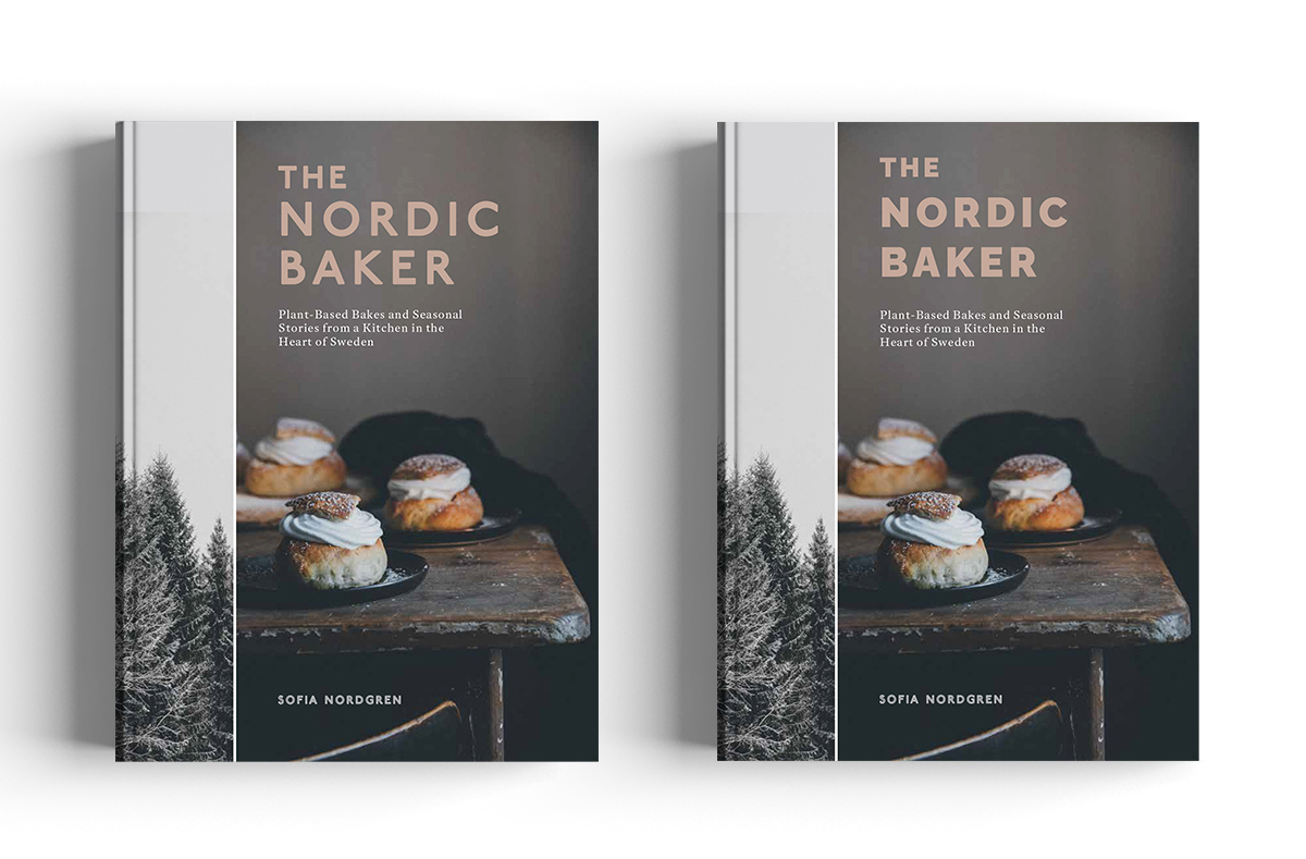
Once the final two images came together we had the idea of using the forest image as a quarter bind, having the image wrap around the front and back. We also wanted to get some lovely texture into the cover too, so went with a subtle graining along with the wibalin quarter bind.
With the title being foiled I decided to use a thicker, heavier weight font to really showcase it, and selected a soft silvery pink colour to tie with the images.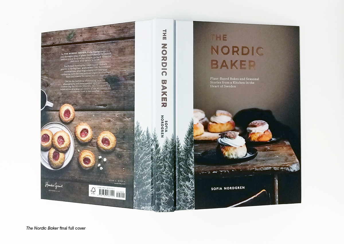
Sofia not only wrote The Nordic Baker, but she also acted as photographer, food and prop stylist for the book. How is the design process different when an author makes up the whole team?
It was such a joy to work so closely with Sofia. We knew from her blog and Instagram that her photography and styling were stunning, so really it was effortless. Everything came together very easily as all the images complimented each other so beautifully. It was never too much trouble to ask for an extra image or another seasonal nature shot to fill any gaps we had. It also meant we had a lot of flexibility with time and Sofia could wait for Spring blossom to arrive, or berries to ripen as we weren't tied to the deadline of a photoshoot.
The photography in the book is stunning. How do you know when an image is cover material?
The photography is hugely evocative, and I think we knew we were looking for an image with some warmth to it - an invitation to the audience almost - to settle down and cosy up with this book. The Semlor buns had exactly this, and personally I love that the dusting of icing sugar on the top of the buns echoes the dusting of snow on the trees of the quarter bind. Little things like that aren’t something you would necessarily notice, but it just brings the two elements together.
The Nordic Baker is not just a cookbook, it inspires you to slow down and celebrate the beauty of nature. Has designing and working on the book changed your perspective and the way you look at nature?
I like to think that I do try to embrace the seasons, and to notice the little differences that each one brings. I am inspired by Sofia’s tips which are scattered throughout the book, such as ways to bring nature into your home, and enjoying a cup of coffee in silence (easier said than done with a toddler at home but something to aim for!)
What are your all-time favourite baked goods?
Hands down cinnamon buns!
How do you spend your time when you're not working?
Usually chasing after my little girl in the park, or we love to bake together.
Where do you find inspiration from?
Instagram is hugely inspiring for me, and I absolutely love browsing bookshops (I could spend hours in a bookshop!)
What is your favourite season of the year and why?
Autumn - changing leaves, lighting candles and cosying up with a good book.
 The Nordic Baker by Sofia Nordgren is out now, available at local bookshops, Waterstones and Amazon.
Read our previous Cover Design Q&As!
The Italian Deli with Katherine Keeble | Crave with Claire Rochford | Sea and Shore with Nikki Ellis | La Vita è Dolce with Susan Le | Bowls and Broths with Han Valentine