When crisis sparks creativity: pandemic magazine covers
We could all pretend it’s business as usual. But these magazines took a bold approach to their covers, not shying away from the difficult subject on everyone’s mind.
Dallas Budde
The coronavirus pandemic has forced publications to rethink their covers in creative new ways. The resulting magazine covers are reflective of our new way of living; they’re unlike anything we’re used to seeing.
The role of the magazine designer, whether across newsstand magazines or in content marketing, is as important as ever to ensure that our situation is handled with sympathy and respect... and sometimes, even absurdity. The best covers stand out and provoke a reaction.


While the message of isolation is one we’ve heard time and again during the pandemic, and the graphic nature of this cover is a stark reminder of the social effects of COVID-19.


The intent is to show how banded together we all are in the struggle against COVID-19, regardless of location. The images are extremely simple in their photographic approach, to draw attention to the subjects themselves and the everyday environment with which they reside. Time offers up the universal sentiment “When the world stops” alongside these everyday images to represent courage, fear, empathy and everything in between.

Editor-in-chief, Emanuele Farneti, explained the pandemic magazine cover on Instagram: “White is first of all respect. White is rebirth, the light after darkness, the sum of all colours. White is the colour of the uniforms worn by those who put their own lives on the line to save ours. It represents space and time to think, as well as to stay silent. White is for those who are filling this empty time and space with ideas, thoughts, stories, lines of verse, music and care for others… a blank sheet waiting to be written, the title page of a new story that is about to begin.”
While nothing can be simpler than a blank cover, the principals behind the cover itself are very arresting and treat the current turbulent times with acknowledgement and respect.
The client brief wasn’t immediately easy to achieve conceptually. Essentially, the cover feature is all about looking back to past worldwide events to provide insight for shaping the future during the current pandemic. Initially, our design team considered commissioning an illustration to bring the concept to life, but as it turned out, a historical reference in the shape of a statue formed the basis of the idea. A simple face mask applied to the sculpture provided theming and relevance, rounding out the idea very simply. It’s a straightforward visual for a complex idea but it provides enough impact to grab audience attention. Sometimes the simplest idea is best.
As showcased in many of these examples, the pandemic has weighed heavily on editorial and design teams and has influenced many to create covers that are thought-provoking and reflective of our times.
The world of content is always on, just as the world is ever evolving.
Dallas Budde, art director
The role of the magazine designer, whether across newsstand magazines or in content marketing, is as important as ever to ensure that our situation is handled with sympathy and respect... and sometimes, even absurdity. The best covers stand out and provoke a reaction.
Vogue Portugal
Vogue Portugal’s striking April magazine cover of two lovers kissing was inspired by a 1930s photo of a couple kissing, wearing surgical masks, during a flu epidemic. Vogue replicated the scene in an attempt to showcase the impact to relationships and highlight our new way of living. The black and white photographic approach references the past while the contemporary modelling pulls us into the now.The Guardian Weekly
The Guardian Weekly’s social distancing cover was launched at a time when a fifth of the world’s population was experiencing some sort of lockdown. To bring the theme of social distancing to life, the creators used a manipulated stock image to effect by adding vast areas of white space.While the message of isolation is one we’ve heard time and again during the pandemic, and the graphic nature of this cover is a stark reminder of the social effects of COVID-19.
GQ Portugal
GQ Portugal’s March magazine cover is intended to cheer people up. Art Director, José Santana, chose the classic 1960s smiley face, a symbol for positivity, for a graphic illustration. The simple graphic is underpinned by two very simple but direct messages: “Everything’s gonna be alright” and “F*ck off COVID-19.” While the coverlines represent defiance and relate to the crisis at hand, the graphic is unexpected in its positive approach during an otherwise uncertain time.The New Yorker
On The New Yorker’s March 9 cover, Trump is wearing a surgical mask over his eyes instead of his open mouth. The publishers chose the illustration because the image was too good to ignore and highlighted, perfectly, the president’s “willful ignorance of facts”. The artist, Brian Stauffer, wanted to make a statement on the obvious ridiculousness that is forced on the American public on a daily basis. An image with so much power and strength needs no accompanying words.Time
Many of us have been doing our work remotely, away from our offices. We’ve also been in various states of social isolation from our friends and loved ones. This has been the case not only in Australia but worldwide. Time’s March 30 issue features a series of alternative magazine covers, each representing the real-life impacts on society, around the world, from a socially isolated perspective. The images showcase real-life scenarios in the UK, US, Italy, Iran and China.The intent is to show how banded together we all are in the struggle against COVID-19, regardless of location. The images are extremely simple in their photographic approach, to draw attention to the subjects themselves and the everyday environment with which they reside. Time offers up the universal sentiment “When the world stops” alongside these everyday images to represent courage, fear, empathy and everything in between.
Vogue Italia
A digital edition of Vogue Italia featured a blank cover in lieu of a regular celebrity or personality feature. Leading up to the release, the magazine was planning a different project for the cover, but it was felt that to speak of anything else – while people are dying – was not in their DNA. As a result, the publisher produced a blank white cover.Editor-in-chief, Emanuele Farneti, explained the pandemic magazine cover on Instagram: “White is first of all respect. White is rebirth, the light after darkness, the sum of all colours. White is the colour of the uniforms worn by those who put their own lives on the line to save ours. It represents space and time to think, as well as to stay silent. White is for those who are filling this empty time and space with ideas, thoughts, stories, lines of verse, music and care for others… a blank sheet waiting to be written, the title page of a new story that is about to begin.”
While nothing can be simpler than a blank cover, the principals behind the cover itself are very arresting and treat the current turbulent times with acknowledgement and respect.
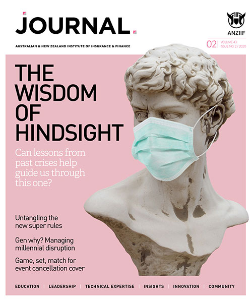
The Journal
Great covers don’t just belong on the newsstand. The world of content marketing also has the job of providing magazines to readerships with striking and arresting covers to provide pick-up value. This is not something necessarily easy to achieve at a time when audiences are distracted by pandemic fears and concerns. At Hardie Grant Media Melbourne we’ve recently published another quarterly issue of The Journal for the Australian and New Zealand Institute of Insurance and Finance (ANZIIF).The client brief wasn’t immediately easy to achieve conceptually. Essentially, the cover feature is all about looking back to past worldwide events to provide insight for shaping the future during the current pandemic. Initially, our design team considered commissioning an illustration to bring the concept to life, but as it turned out, a historical reference in the shape of a statue formed the basis of the idea. A simple face mask applied to the sculpture provided theming and relevance, rounding out the idea very simply. It’s a straightforward visual for a complex idea but it provides enough impact to grab audience attention. Sometimes the simplest idea is best.
As showcased in many of these examples, the pandemic has weighed heavily on editorial and design teams and has influenced many to create covers that are thought-provoking and reflective of our times.
The world of content is always on, just as the world is ever evolving.
Dallas Budde, art director
|
Don't miss our monthly content marketing insights. Subscribe to The Lead. |